349 West Georgia Street
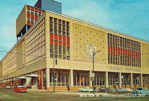
The opening of the Main Post Office (1953-58) marked the beginning of Vancouver’s development as a regional centre in the postwar era. At the time, it was one of the largest Federal Government buildings in western Canada.
This massive building occupies an entire city block bounded by Georgia, Homer, Dunsmuir, and Hamilton Streets. It was recently sold, and no plans have been announced for its future. There is no heritage protection for this building, and it is not listed on the City of Vancouver Heritage Register. The future of this site is unknown.
Threat
What is the threat to the Main Post Office?
The Main Post Office has been sold by the Federal Government to the British Columbia Investment Management Corporation (bcIMC), one of Canada’s largest institutional investment managers. Canada Post will be moving all operations from this location to a new processing plant in Richmond that is scheduled to open in 2014.
As a consequence, the West Georgia Street site and building will be redeveloped in some manner, either through complete or partial retention of the structure, or else demolition or redevelopment. The Federal Government has not placed any heritage protection status on the building. It is listed on the City of Vancouver Recent Landmarks Inventory but it is not on the Heritage Register and is not legally protected in any way.
Significance
Why is the Main Post Office significant?
The Main Post Office is significant for its monumental International Style architecture, its civic presence, its connections to the Federal Government and its landmark status.
This massive structure was a substantially larger replacement for the original Beaux Arts style Main Post Office building (1905-10) located at the corner of Granville and Hastings Streets. With a total floor area of 686,000 square feet and a construction budget of $13 million dollars, it was designed by the prolific Vancouver architectural firm McCarter Nairne & Partners in association with staff architects from the Federal Department of Public Works. McCarter & Nairne were a dominant force in public architectural commissions for several decades and completed many major projects including the Medical Dental Building (1928-29, demolished) and the Marine Building (1928-30).
The massing of the building is composed of two distinct elements, a five-floor rectangular base which essentially fills the entire footprint of the site at grade and a three floor rectangular block on top. The upper block runs the full width of the block below but is set back approximately 100 feet from the Georgia Street façade and is largely visible only from either Homer or Hamilton Streets. The base incorporates a pedestrian colonnade along Georgia Street in front of a double height public Postal Hall with the mail processing areas stacked behind. The upper block incorporates offices; a more ambitious but unrealized design featured an eleven-floor office block.
The Main Post Office is one of the most significant local examples of International Style architecture that was being applied to civic and institutional projects across the nation at this time. In the 1930s, the term “International Style” came to describe a new approach to building evolved by European architects such as Ludwig Mies van der Rohe (1886-1969), Walter Gropius (1883-1969), and the Bauhaus School (founded in 1919 by Gropius, later directed by Mies van der Rohe, and closed in 1933). The International Style, with its rationalist formal idiom and solutions to construction problems, was the model for modern building well into the late 1980s. Using modern materials such as steel, glass, and concrete, it established an aesthetic founded on the thrill of pushing architecture to the absolute limits of technical and economic viability. The Main Post Office is the best, fully intact example of this style to be found in Vancouver. Most other local examples have either been demolished (the Canada Customs Building 1950-54 designed by C.B.K. Van Norman) or unsympathetically altered.
From a broad perspective, there are three defining principals of International Style buildings. The first of these is “architecture as volume”. This principal manifests itself through skeletal structural systems whereby floor plates are supported by a regularly spaced grid of steel or reinforced columns thus allowing for flexibility in plan. This principal was most successfully applied to industrial, institutional or commercial building types. The Main Post Office clearly exemplifies this principal and was the largest welded steel structural frame building in the world at the time of its completion. The second of these defining principals addressed the overall architectural expression of the building skin in combination with the selection and detailing of materials, both exterior and interior. Ideally the surface of the contained volume would be seen as an unbroken skin stretched tightly over the building’s skeletal frame. The character of the skin’s surface was of the utmost importance. Smooth planar materials were favoured for their ability to produce a surface as unbroken as possible. McCarter & Nairne’s interpretation of the International Style represents a sophisticated melding of its strict programmatic functionalism and defining principals – a skeletal structural steel frame, and an appropriate yet simultaneously eclectic palette of materials including granite and marble cladding on columns and walls, terra cotta wall tiles (one of the last uses of this material as a wall cladding in Vancouver), cast concrete wall panels, terrazzo floors, and large banks of aluminum framed windows all of which were meticulously detailed – with large scale urban/public gestures.
The Main Post Office is, as a result of its essentially industrial programme, of an inherently massive scale and for the most part not publicly accessible. Yet it is located on what has always been a prominent downtown site. McCarter & Nairne made several clear and strong architectural gestures directed towards both breaking down or visually separating the mass of the building, and providing for a strong public presence. The main mass of the building is relieved by the Georgia Street façade, which is set back at grade from the floors above in order to provide for a covered pedestrian colonnade. Breaking the façade in this way also provides horizontality to the overall composition. The remaining three facades present similar proportions, with continuous bands of windows at the top of the lower floor creating a visual separation between the floors above as well as allowing light into the workspaces behind. Additionally, on all facades, the lower and upper floors are given a further degree of visual separation through the contrast of dark granite wall cladding on the lower floor and a combination of flat cast concrete wall panels alternating with large banks of aluminum-framed windows complete with burgundy terra cotta tile spandrel panels on the upper floors. Other than along Georgia Street the building offers very limited human scale or transparency at the pedestrian level. This is an obvious reflection of the nature of the building’s technical programmatic requirements, and as such should not be seen as a lack of care for, or attention to such gestures by the architects.
The Georgia Street façade and colonnade in combination with the grand double-height Postal Hall, which could originally be entered from Georgia, Hamilton, and Homer Streets, are the key elements in terms of the urban/ public expression of the building. Access to the eastern third of the Hall has unfortunately been blocked to the public, however the original space and finishes seemingly remain intact and that portion of the Hall could be fully reinstated.
The third and final defining principle of the International Style mandated the “avoidance of applied decoration” and was seen as an attempt to eliminate superficiality. At the same time it was recognized that decoration has always been an important part of architecture. The compromise position was that any decoration should be both minimal and designed to be “subservient to the clarity of the building as a whole.” Sculpture and painting were seen as complementary elements that could add to a building without “degenerating into mere ornament.” Several works of art were in fact created specifically for both the exterior and interior of the Main Post Office and remain in situ. Each of these pieces was executed using materials found within the overall palette of the building, and speak to, or reference, the purpose of the building rather than being random decorative elements. Included in this group are two 19-foot high cast aluminum Canadian coats of arms (by Pearson Iron Works) adjacent to the Georgia Street entrance, “The Postman”, a 16-foot high carved granite bas relief by Paul Huba adjacent to the Homer Street entrance, a large ceramic mural designed, modelled and fired by Paul Huba inside the original Georgia Street lobby (still intact but partially obscured from view due to a subsequent reduction in the width of the Postal Hall), and a mural by Orville Fisher above the elevator doors in the Homer Street lobby which depicts various methods of mail delivery used in the early days of the Province. A figure of Mercury, bearer of glad tidings is superimposed above.
Recent developments
The Main Post Office is located within the Downtown Official Development Plan (DODP). Under the DODP, all development is discretionary. While it is impossible to anticipate the eventual uses, density, or form of future development it is known that based upon the existing zoning, in combination with possible discretionary rezoning, density transfer and/or heritage incentives the redeveloped site could include buildings ranging in height from approximately 225 to 285 feet, and mixed uses including commercial, residential – market, rental, and affordable – and social/cultural. The City of Vancouver has stated it anticipates that all development proposals will deliver a minimum 7.0 Floor Space Ratio (the existing building only delivers an FSR of +/- 3.0 as a result of high floor to ceiling heights which are more typical of an industrial space), and that all will be comprised of commercial/non-residential uses. It has also stated that any rezoning would only be approved if it resulted in the achievement of significant public benefits. Examples of relevant benefits from past rezonings include the retention of significant heritage values, the provision of social or cultural facilities and the provision of affordable housing. All basic information related to current regulations and policy applicable to the site and building, as well as the possibility of rezoning is detailed in the ‘Post Office Site Policy Information Note’ issued by the City on February 16, 2007 and last revised April 7, 2010.
A representative of bcIMC was interviewed for a Vancouver Sun article (January 25, 2013) that reported the sale of the building. The stated goal for the site was “a sustainable mixed-use development that will leverage the great transit and nearby amenities that the site offers.” The site is in fact located at the centre of what could eventually become the cultural heart of Vancouver. Within the immediate vicinity are the new CBC complex, the main branch of the Vancouver Public Library, and the recently renovated Queen Elizabeth Theatre. Additionally, the adjacent and City owned Larwill Park block remains under discussion as the potential site for a relocated and expanded Vancouver Art Gallery. The bcIMC representative also stated that, “the status of the existing building will be considered as part of the whole development planning process.” A positive note, especially as it relates to the preservation of Vancouver’s Modern architectural heritage is that bcIMC also owns the heritage-designated Arthur Erickson-designed Evergreen Building (1979/80) at 1285 West Pender Street. Under their stewardship, this landmark modern building has been carefully upgraded while retaining the architectural integrity of Erickson’s original vision.
When considering what form the redevelopment of the Main Post Office site and building might take the sheer size, extremely large and relatively open floor plates, above average floor-to-ceiling heights and overall physicality of the existing building are all factors that would seem to work in favour of its retention and renovation in combination with an addition or additions.
The new owners have suggested a mixed-use development and this in fact seems the most likely and appropriate option. There are many proponents for a move by the Vancouver Art Gallery into the building, citing the conversion of the former Bankside Power Station in London England into the Tate Modern gallery as a significant, viable and exciting precedent (see an independently written Op/Ed column in The Vancouver Sun dated February 28, 2013). To date however this idea seems to have gained little or no traction with the gallery’s Board of Directors. The proposed programme for a new art gallery building represents 300,000 square feet, which is under one half of the existing floor area available in the Main Post Office; based upon square footage alone the potential for such a move might still exist.
Simon Fraser University has expressed an interest in taking space in the redeveloped building in order to expand their downtown campus. Other potential tenants certainly exist and perhaps all of them could come together in a mixed-use development additionally incorporating other civic, cultural, and educational uses in combination with offices and retail. Whatever architectural form the future development takes, it presents the opportunity for a mix of tenants that would be key to providing an ongoing stimulus for both job creation (some 1200 Canada Post jobs will be transferred to the new facility in Richmond) and a socially vibrant downtown core.
A local redevelopment project involving a building with several key similarities to the Main Post Office which can offer some illustrations of relevant architectural strategies is the proposal (now approved) by James K.M. Cheng Architects Inc. for the Eaton’s – later Sears – store located at the corner of Georgia and Granville Streets (Pacific Centre). This building also occupies an entire city block, is similar to the Main Post Office in floor area (approximately 510,000 square feet), has large open floor plates in combination with high ceilings, and suffers similarly from an overall lack of openness and transparency at street level. Demolition of the building was not considered due to the large amount of well-built and maintained floor space available. Under the proposal the seven-floor building will be converted from all retail use to three floors of retail use (Nordstrom department store) with four floors of office space above. Major portions of the existing blank exterior walls will be replaced with glazing right to street level, two atriums will be cut into the core of the building, essentially cutting it in half and providing for both natural light and ventilation, and a publicly accessible landscaped roof will be incorporated. Some of these strategies could be applied to the Main Post Office, while simultaneously preserving its monumental architectural heritage.
Position
Heritage Vancouver’s position
The Main Post Office is clearly significant both as a fully intact example of the city’s Modern architectural heritage and as a potential anchor for the City’s urban and cultural development.
Throughout the redevelopment process, the City of Vancouver should make every effort to negotiate with and engage all relevant parties with the twin goals of preserving the overall integrity and most significant architectural features of this grand landmark, and incorporating civic and cultural uses/spaces that Vancouver currently lacks.
